Layouts
A document's body is a box on the screen. Position it, give it a size,
and lay its contents out with block and flex layout.
A HUD in a corner
<rml>
<head>
  <link type="text/rcss" href="/sagl/ui/theme/base.rcss"/>
  <style>
    body { position: absolute; right: 24dp; top: 210dp; width: 220dp; }
    .panel { display: block; width: 192dp; padding: 10dp 14dp; }
    .title { display: block; font-family: sa-menu; font-size: 16dp; color: #2fb3a0;
             font-effect: outline(2dp #000000); margin-bottom: 4dp; }
    .team { display: flex; flex-direction: row; justify-content: space-between; }
    .cops { color: #6a8cff; }
    .robbers { color: #ff4a4a; }
  </style>
</head>
<body>
  <div class="panel">
    <span class="title">Round 3 - 04:12</span>
    <div class="team"><span class="cops">Cops</span><span id="cops">12</span></div>
    <div class="team"><span class="robbers">Robbers</span><span id="robbers">9</span></div>
  </div>
</body>
</rml>
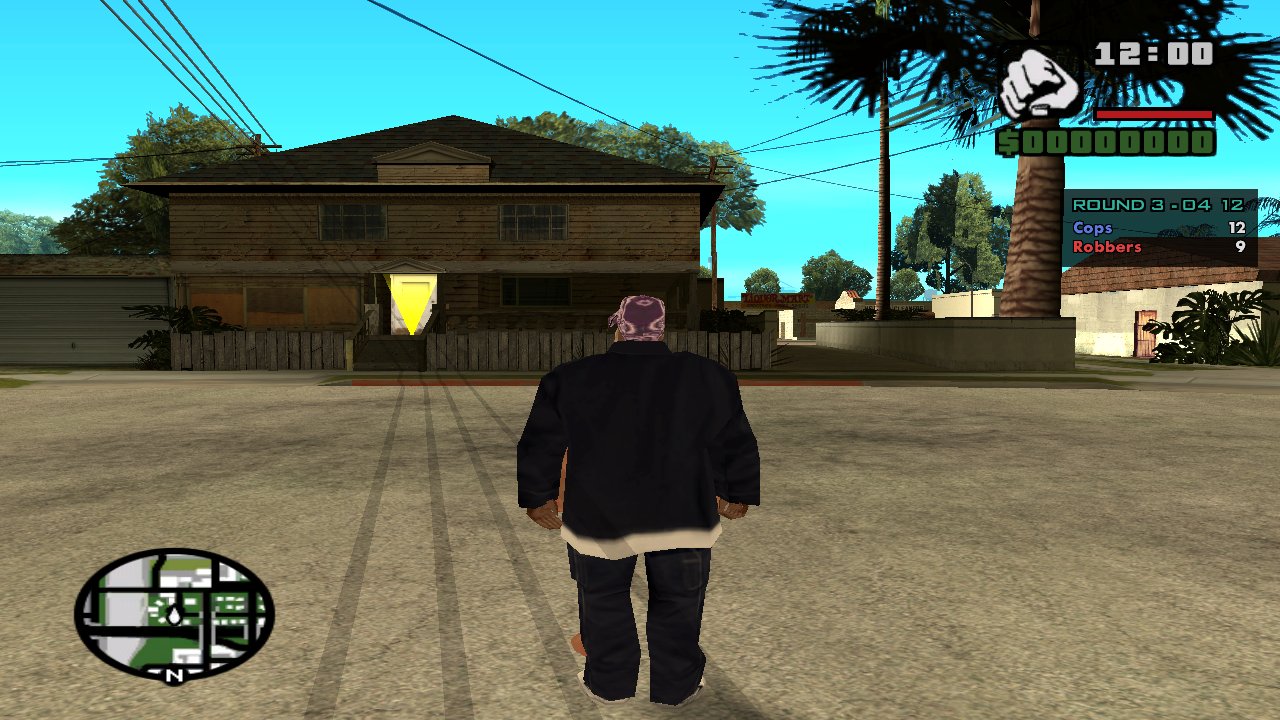
Open it with { input: false } so the player keeps playing.
Keep clear of the game's HUD
The game draws its clock, weapon, health and money top right, and the
radar bottom left. Start corner HUDs below about top: 200dp on the
right.
Give panels a width
A .panel inside an absolutely positioned body may shrink to nothing
and lose its background. Give it display: block and a width.
A centred dialog
body { width: 100%; height: 100%; background-color: #00000060; }  /* dims the game */
.panel {
  position: absolute;
  left: 50%; top: 45%;
  width: 480dp;
  margin-left: -240dp;
  transform: translateY(-50%);
}
Open it with input (the default) so the cursor shows and Esc closes it.
For yes/no questions, prefer sagl.ui.messageBox().
A full-screen menu
Like SAGL's pause menu: header, a page that takes the space left, and a row of options at the bottom. Flexbox does it:
body { width: 100%; height: 100%; }
.menu {
  position: absolute; left: 0; top: 0; width: 100%; height: 100%;
  box-sizing: border-box;
  padding: 28dp 40dp 20dp 40dp;
  background-color: #000000b0;
  display: flex; flex-direction: column;
}
.header  { flex: 0 0 auto; }
.content { flex: 1 1 0; position: relative; overflow-y: auto; }
.options {
  flex: 0 0 auto;
  display: flex; flex-direction: row; flex-wrap: wrap; justify-content: center;
}
flex-wrap: wrap puts options that don't fit on a second row.
Pause menu pages
A page's RML is the body of a page inside the pause menu: no <rml> or
<head>, just content. It fills the area between the menu's header and its
options row (scrolling if it's taller), and the pause menu's styles apply:
| Class | |
|---|---|
h2.first |
A heading with no space above (the first on the page). |
.subtitle, .note |
Light blue text. |
.list .item |
Selectable rows. |
.row, .label, .control |
Settings-style rows: a label on the left, a control on the right. |
button |
Menu items. |
.status |
A status line. |
<h2 class="first">Garage</h2>
<div class="row"><span class="label">Colour</span>
  <div class="control"><input type="range" id="colour" min="0" max="126"/></div></div>
<div class="row"><span class="label">Neon</span>
  <div class="control"><input type="checkbox" id="neon"/></div></div>
<button id="buy">Buy - $5,000</button>
Sizes and units
dpscales with the screen's height: 1dp is 1px at 800 pixels high, 0.9px at 720p, 1.35px at 1080p (never below 0.7px). Use it for everything, and layouts keep their proportions.%of the parent works for widths, heights and positions.emfollows the font size.
Images
Give images both a width and a height (or one and let the other follow). For a background that covers an element, use a decorator:
.banner { height: 120dp; decorator: image(banner.jpg cover); }
.fade   { decorator: vertical-gradient(#00000000 #000000e0); }
Scrolling
overflow-y: auto on a box with a fixed height scrolls it. The theme
styles scrollbars thinly; restyle scrollbarvertical, slidertrack and
sliderbar to change them.
Keyboard and gamepad
Documents with input can be driven with arrow keys, Enter and a gamepad.
Elements need tab-index: auto and nav: auto (the theme gives them to
buttons, list items and inputs) to take focus; :focus-visible styles the
focused one.